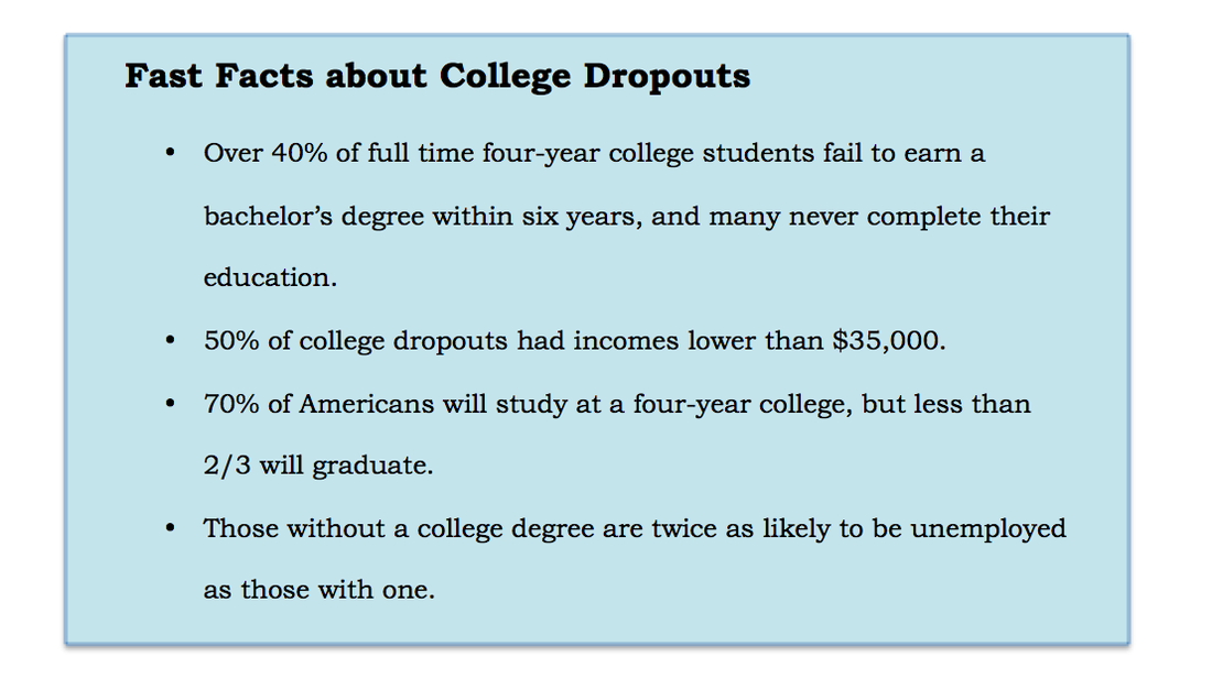
Information found at http://www.collegeatlas.org/college-dropout.html

This study started in 1997, and followed about 9,000 students from 12-16 years of age, all the way until 2011. They were interviewed each year about their high school and college education and their family backgrounds.
This chart organizes students by their demographics: female, white, black, Asian or Hispanic. Also, it has statistics for five different types of way students can end their post high school education. Students either never enter postsecondary education, students who enter a two-year college and never earn an associate’s or bachelor’s degree, students who enter a four-year college and never earn a bachelor’s degree, students who complete an associate’s degree, and students who complete a bachelor’s degree.
From the results you collect from the charts, it’s easy to see that students who complete the two-year college, are also more likely to be the ones who are successful at a four year college. Also, demographics play are a huge deciding point between students who graduate from a four year college, and those who drop out from a four year college.
Yet, what is found to be most surprising demographic, is the rate of students who complete a two year degree, is similar to those who drop out of a four year college. This arises the question, would the rate of four-yea college drop-outs decrease if they started a two year college?
SOURCE: http://www.air.org/sites/default/files/downloads/report/AIR-CALDER-Understanding-the-College-Dropout-Population-Jan14.pdf
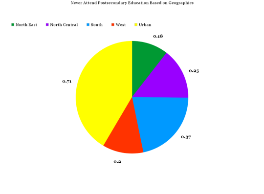
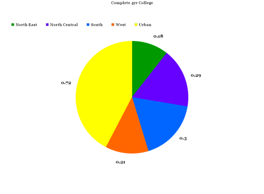
The data for this study come from the National Longitudinal Study of Youths 1997 (NLSY97). The student characteristics in the pie chat the student and geographic information about the location of the student’s home.
The first pie chart represents students in America that never attended post-secondary education, based on their location. If you only look at this chart alone, you can see that Urban Areas have higher rates of people who are not attending any type of college. The rest of the pie chart is fairly equal.
The second pie chart shows the rate of students who are graduation four year institutions from different geographic locations. This also shows that urban areas have the HIGHEST rates of graduations from four year colleges.
How does this make sense? Well, interestingly enough, if you compare the two pie graphs side by side, you can see that all of the areas have similar ratios on the graph. Who is not attending college, compared to who is graduating a four year college, are extremely close numbers. This is caused by the numbers of people living in these places. That is why urban areas will always be a large percentage on either graph.
SOURCE: http://www.air.org/sites/default/files/downloads/report/AIR-CALDER-Understanding-the-College-Dropout-Population-Jan14.pdf
 RSS Feed
